BrainStation Bootcamp Capstone Project

Client: BrainStation Bootcamp Capstone Project
Project Type: Academic Aug-Oct 2020
Role: Lead Product Designer
Timeline: 8 weeks
Tools: Sketch, Figma, In Vision, Principle, Marvel POP, Pen & Paper, Adobe Photoshop
What’s Timbre?
Timbre is a music application that combines both mood and therapeutic genres and provides a personalized experience of selecting a song in a few easy steps.
Project Overview:
“After silence, that which comes nearest to expressing the inexpressible is music.” — Aldous Huxley.
How many times when you’re frustrated to have picked up your phone and put up a song to brush off that feeling? Or have you put up a song to upbeat your mood?
As mental health stigma continues to dissipate, more and more people are trying to find alternative ways to cope with it other than the traditional methods. Some people find publicly available treatments only effective about half of the time, and most of them deal with it on their own and turn to music to distract themselves.
And that’s where Timbre comes into the picture. It is a music application for those who consider music a go-to for when they feel stressed, anxious, or looking for alternate mediums to deal with their mood.
Discover of Problem Space
Music heals the soul.
Music entered my life pretty late, only after I started finding ways to deal with my mental health struggles. Getting myself a good therapist was my first option, but something told me it wasn’t enough to cope with my mental stress. Plus, finding the right balance of an excellent affordable therapist felt like an extra task to complete.
That’s when I started finding music that could help me cope with the stress and help me get through my day.
For this project, I wanted to explore this problem space further and find a solution for the people who see music as an escape from their mental stress.
Assumptions
- People are aware and talk about their mental health and struggles related to it.
- Most people are already finding alternate ways to deal with their stress and anxiety.
- Finding affordable therapists who are relatable is a pain point for people.
- Stigma or discrimination attached to mental illnesses presents a serious barrier.
- Music is currently a “go-to” distraction that helps them manage their moods but is still exploring playlists, which will help them feel better.
Design Process
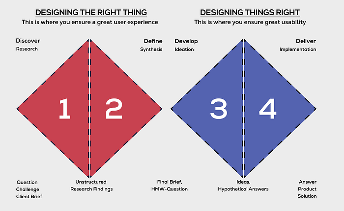
The approach that I used to design the application is the Double Diamond Design Process. It helped me get a more in-depth analysis of the target audience.
Explore the problem
Secondary Research
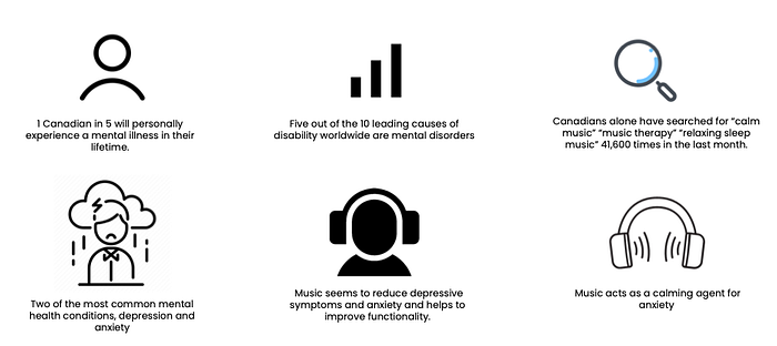
Mental health problems have rapidly been on the rise in the last few years. Following were the highlights that I found through my research:
Primary Research
To empathize further with the user needs and behaviors, I conducted research that included a survey with 7 participants, all on video Zoom/Google calls.
The interview goal was to gain a high-level understanding of the user’s behavior, pain-points, and motivations.

This got me to my “ How might we statement —
How might we use music as a way to help those who don’t have access to traditional therapy to manage stress and anxiety?
Decide what to fix
After bifurcating behavior, pain points, and motivations, the next step was to slice the data into insight and theme.
First Set of Insight

Persona
Based on my above research, I would like to introduce you to Alex:

From the interview insights, I was able to get a better understanding of my persona’s experience journey. I crafted the experience map to understand where the opportunity is for my digital solution.

Task Selection
User Stories
Using the How might we statement and considering Alex’s person and experience map, I created a set of 30 user stories under four epics to help me define my product’s function.
I chose the following epics and user stories to create my minimum viable product (MVP).
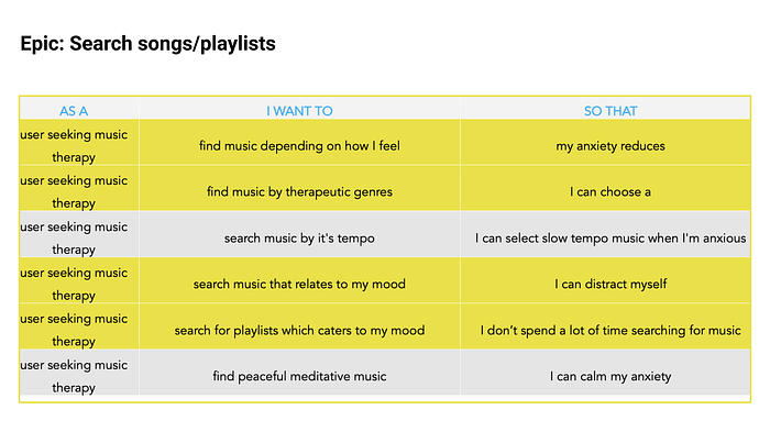
I chose to move forward with the following epic:
The highlighted ones are the main tasks I chose to move forward with.
Starting to Sketch My Solution
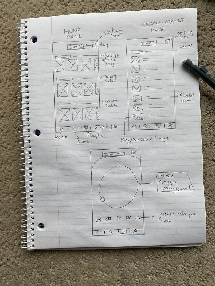
Once I was clear on the main task flow, I took to paper and pen to sketch the possible solution. Using inspirations from other existing UI components and looking at functionalities from apps like Spotify, Apple Music, and many other mental health care applications, I started sketching out different ideas. (my focus was more on the lo-fi wireframe than the sketches)
Test Potential Solutions
After going through the ideation process above for each screen, I created the first wireframe in low-fidelity.
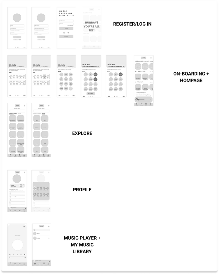
Moving ahead, I did usability testing, a technique used in user-centered interaction design to evaluate a product by testing it on users. I did two rounds in total, and each session had five people testing the prototype.
The testers had to complete six tasks in total. I used the feedback from the first round of usability testing results to inform my design changes for the next wireframe iteration.
Feedback
The feedback of the first round was as follows:
- The users found the functionality of the app pretty straight-forward
- The navigation bar icons were relatable
- The emoji on the onboarding screen didn’t give a realistic feel to the application.
Improvements to be made to:
Onboarding Screens: The options provided during the onboarding could be more precise
The profile section: was right, but not to populate it with a lot of options.
Library label: wasn’t too clear / change to something more universal.
Refine the Solution
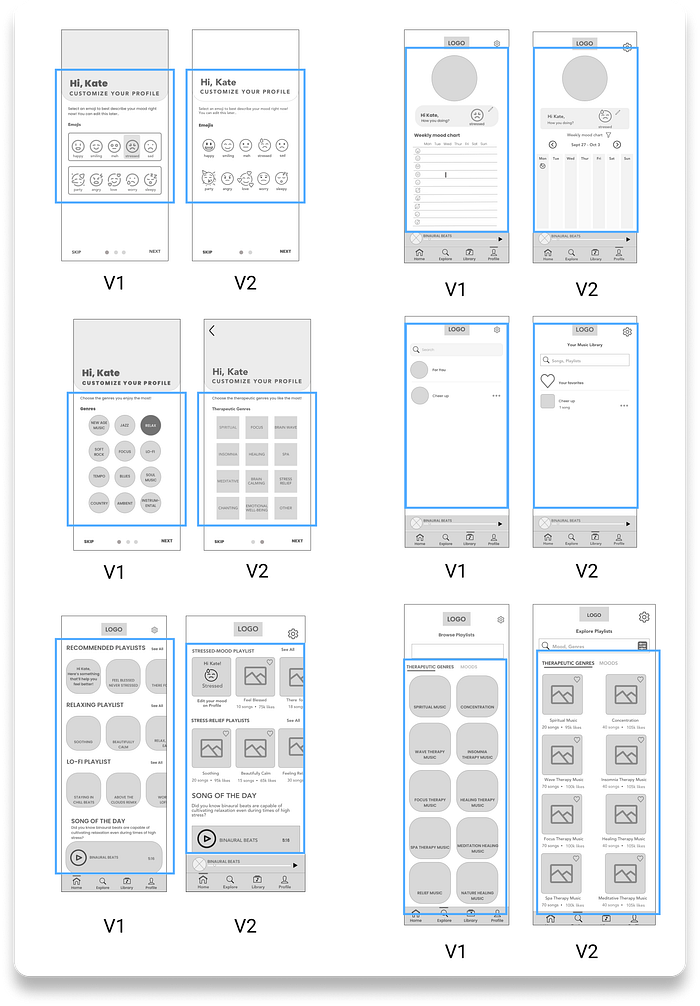
From the feedback I received in testing Round 1, design changes were made to the prototype. I took the next iteration of wireframes to Round 2 of usability testing and continued to iterate.
Here is the final wire flow after two rounds of usability testing, which was used to design high-fidelity.
Visual Identity
Moodboard
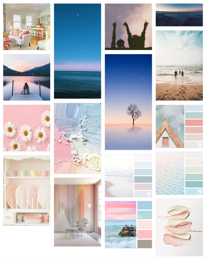
I wanted my mood board to depict a fun, calm, happy, light, and soft-hued vibe.
Color Palette
I extracted the colors from the mood board, and I used the 60–30–10 color rule, a straightforward rule for creating a well-balanced color palette.

Click here to see a detailed mood board for the colors selected to show “moods” and “genres” in the application.

Word Mark
What’s the rationale behind the app name?
Timbre means a particular musical instrument or human voice has a different sound from another, even when they play or sing the same note.
The rationale for keeping the name was on similar lines; sometimes, the same music has a different impact on the human mind.

Hi-fidelity Prototype
Knowing the visual identity was very colorful, and the application design would have different colors for mood & genre, I needed to be careful with how I applied them. To make the UI feel colorful and fun but still focus on the content, I decided to inject the colors in the playlists’ cards.

If you’re interested in the interactive prototype, please click here.
Responsive Marketing Website
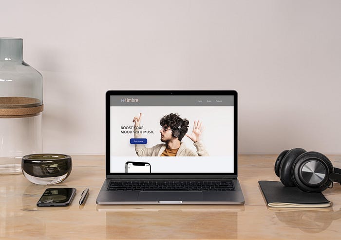
Next, I developed a Marketing website, which I think is the best way to build trust in the application. This way, people will know where to go when they want to learn more about my app and what they can expect in the future.
The full prototype for the desktop can be found here.
Multi-platform Challenge
Design Impact & Future Thinking
To further think about the design I’ve created, I used tech’s tarot cards to answer it.

I picked —
THE SERVICE DOG | TAROT CARDS OF TECH
If your product was entirely dedicated to empowering the lives of an underserved population, what kind of impact could you make? Who could your product most directly benefit outside of your target users? How would your product change to better serve them?
TO ANSWER THIS
The application’s idea is to help the user find a song depending on their mood within a few clicks. So, using the application will allow the user to think less and enjoy the music more.
And anyone who loves music can use this — it’s more about the user, less about the application!
Key Learnings
#1 Empathy — Put the users above everyone! Personas and empathy maps are one way to understand user needs and remind everyone of those daily powerfully.
#2 Feedback Is King — One of the most important skills people miss is learning to receive feedback. It might sound easy, but most people don’t know how to do either. It took me a while to realize it during the course, but it is critical for making design decisions.
#3 Iteration — Anything that developed from scratch will be an assumption. It’s essential to keep iterating to understand the users and their needs while they evolve. If a test fails, test again.
What’s my next step?
The aim is to re-work the mood board to make the app’s color as per the accessibility standard — meeting the WCAG 2.0 AA guidelines for accessibility.
